Your blog post
Blog post description.
5/30/20263 min read
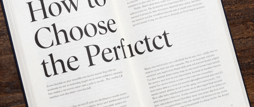
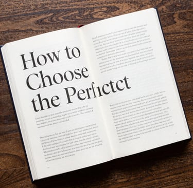
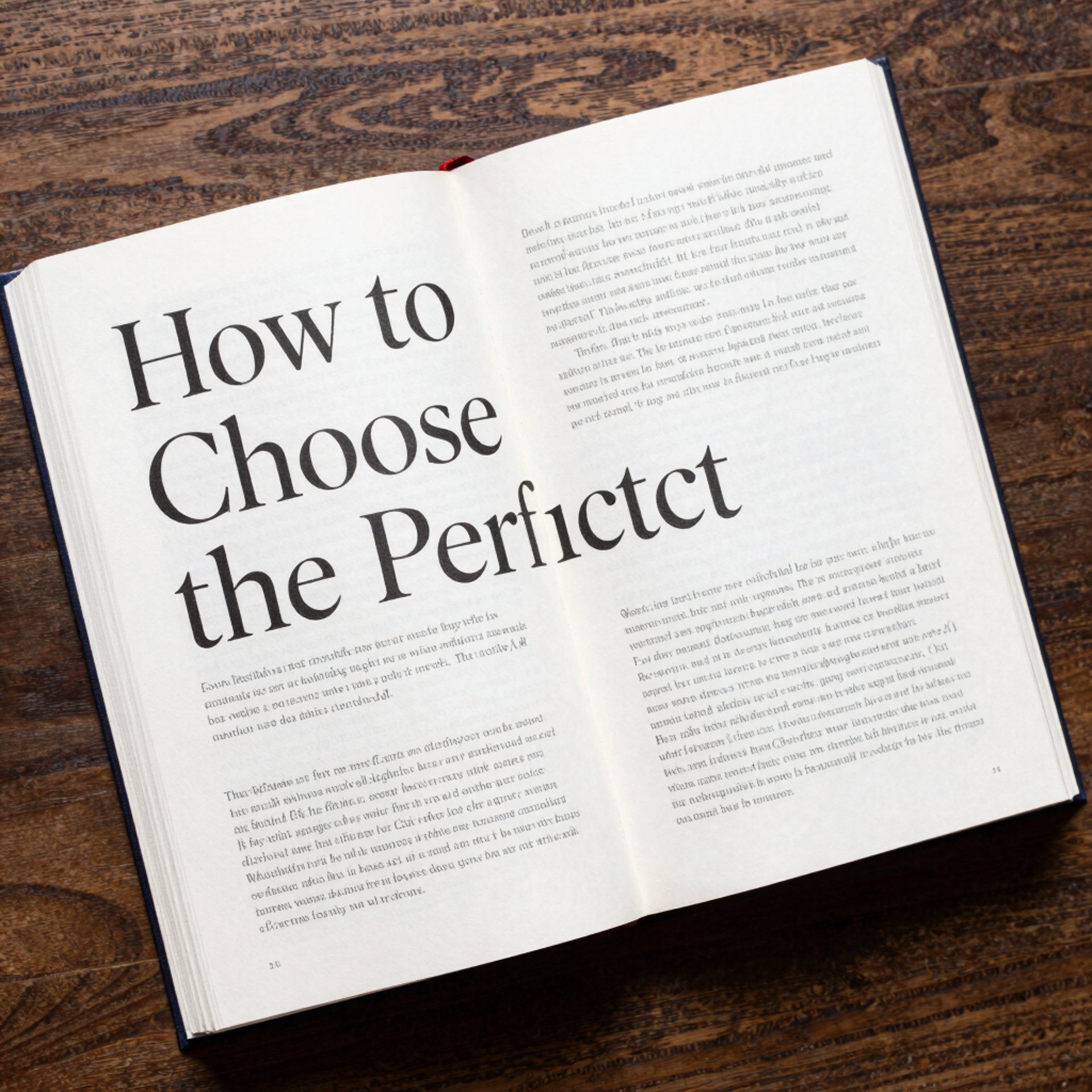
The Art of the Page: How to Choose the Perfect Typography for Your Book
Have you ever picked up a book, read a few pages, and felt instantly fatigued? Chances are, the story wasn't the problem—the typography was.
When it comes to book design, good typography is essentially invisible. It shouldn't distract the reader; instead, it should create a seamless, immersive experience where the words effortlessly disappear into the story. Whether you are self-publishing your debut novel or designing a nonfiction guide, choosing the right fonts is one of the most critical decisions you will make.
Here is your comprehensive guide to selecting the perfect typography for your book.
1. The Golden Rule of Body Text: Stick to Serifs
For printed books, the general consensus among designers is almost unanimous: use serif fonts for your body text.
Serif fonts have tiny decorative strokes at the ends of the letters (think Times New Roman or Garamond). These strokes help guide the eye along the line of text, making long reading sessions much easier on the brain.
Top classic serif fonts for book interiors:
Garamond: Elegant, classic, and space-saving.
Baskerville: Slightly wider, offering excellent readability and a traditional feel.
Palatino: Sturdy and highly legible, great for both fiction and non-fiction.
Minion Pro: A modern favorite in the publishing industry.
Note on Digital Books: If you are designing an eBook, sans-serif fonts (like Arial or Helvetica) are often preferred by e-readers because they render more cleanly on low-resolution screens. However, most modern e-readers allow users to choose their own fonts anyway!
2. Match the Font to the Genre
Typography sets the mood before the reader even processes the words. Your font choices—especially for chapter titles, headers, and the book cover—should reflect the genre and tone of your writing.
GenreTypography StyleFont SuggestionsFantasy / HistoricalClassic, ornate, or old-style serifs.Cinzel, Caslon, TrajanSci-Fi / ThrillerClean, sharp, and geometric sans-serifs.Futura, Montserrat, Bebas NeueRomanceElegant, flowing scripts paired with soft serifs.Playfair Display, Great VibesNon-Fiction / BusinessAuthoritative, clean, and modern.Lato, Georgia, Merriweather
3. The Magic is in the Spacing
Choosing the right font is only half the battle. How you arrange that font on the page is what separates amateur self-published books from professional traditionally published ones. Keep an eye on these three elements:
Leading (Line Spacing): Don't cram your lines together. The space between lines should generally be 1.2 to 1.5 times the size of your font. If your font is 11pt, your leading should be around 14pt.
Margins: Give your text room to breathe! Ensure your margins are wide enough so the reader's thumbs don't cover the text while holding the book. Pay special attention to the "gutter" (the inside margin where the pages are bound).
Alignment: Most printed books use Justified text (straight edges on both the left and right sides) rather than left-aligned text.
4. Pair Fonts Like a Pro
A common mistake is using too many fonts. A well-designed book rarely needs more than two.
To create a beautiful, professional hierarchy, use the Serif + Sans-Serif rule.
Pair a highly readable serif font for your body text with a bold, clean sans-serif font for your chapter numbers and titles. This creates contrast and visual interest without overwhelming the reader.
5. Don't Forget the Licensing!
Before you fall in love with a font and format your entire 80,000-word manuscript, check the license.
Just because a font is free to download does not mean it is free for commercial use. If you plan to sell your book, you must ensure you have the commercial rights to the fonts you are using. Websites like Google Fonts offer fantastic, high-quality typefaces that are completely free for commercial projects.
Final Thoughts
Typography is the silent narrator of your book. Take your time, print out test pages, and read them in different lighting. By focusing on readability, matching your genre, and mastering your spacing, you will craft a beautiful reading experience that keeps your audience turning the pages long into the night.
Happy publishing!